Every day I encounter data stories that are both technically correct and wildly inaccurate.
How is that possible?
Correctness is binary. At least, it is when describing a piece of data. Any number higher than 50% — whether that number is 51% or 100% — could be correctly described as “more than half.” Any group that contains at least 24 items — whether the total is 30 items or 300 — could be correctly described as “dozens.”
Recently a client produced a chart showing a survey response of 53%, and described that data in the text as “more than half.” When it turned out the number was actually 78% they updated the chart but left the text untouched. Technically this was correct because 78% is higher than 50%.
Accuracy requires proximity. They say that close only counts in horseshoes and hand grenades. I’d argue it counts in good data as well. Good data relies on accuracy to help readers better understand the numbers and the insights behind the story.
So while calling 78% “more than half” is correct, it’s far from accurate; “more than three-quarters” would be both correct and accurate. And while calling 300 items “dozens” is technically correct, it’s not at all accurate; “hundreds” would be a far better word choice.
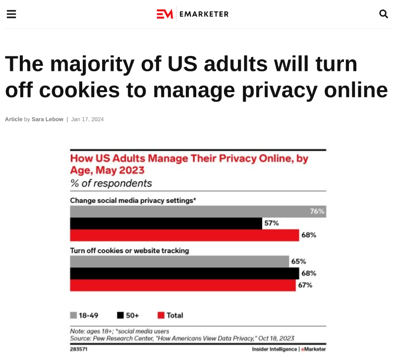
This may sound theoretical or obvious — but I run into correct-but-inaccurate data all the time. My latest favorite example is an Emarketer chart title that refers to refers to 67% as simply “the majority”:
Emarketer chart that refers to 67% as “the majority.” Source: Emarketer.
Yes, 67% is more than half. But no, that wording doesn’t paint an even vaguely accurate picture of the data.
(And that’s without mentioning that the headline screams about cookies but ignores a response that finished higher in the survey.)
Thanks for reading. If you’ve seen other data stories that are both correct and inaccurate, post them in the comments below or on LinkedIn. And if you want good data delivered to your inbox, subscribe here.


