When Muhammad Ali said “I am the greatest,” the world believed him, because he was. But there are lots of reasons we shouldn’t be so accepting when others tell us how great they are.
For instance, which advertising medium is the best? It depends on who you ask:
Radio is the greatest. A recent Radio Advertising Bureau study [pdf] shows heavy radio listeners have more brand conversations than heavy consumers of other channels, and most of those conversations create purchase intent.
Actually, magazines are the greatest. Research from the News/Media Alliance reports 87% of Americans have read a magazine in the past six months, and nearly 8 in 10 took action as a result of magazine ads.
Or maybe it’s billboards? A report from the Out of Home Advertising Association of America [pdf] says 88% of Americans have seen out of home ads in the last month, and almost half of them made a purchase afterwards.
It’s no surprise that biased messengers offer us biased conclusions. These industry groups were founded and funded by ad sellers in each medium — it’s their job to say good things about their channels. As Muhammad Ali said, “I figured if I said it enough, I would convince the world that I really was the greatest.”
Organizations have lots of tricks for making sure this kind of research looks great. It’s important to look for these tactics and make sure you don’t repeat brand-funded nonsense:
They can skew samples. Different data samples can yield very different numbers. When Facebook launched the Threads app, it grew quickly. But in the US, daily active use peaked at 2.3 million users in July 2023 — less than 1% of the US online population. The same month, when online marketer David Berkowitz asked his LinkedIn followers if they used Threads, a whopping 64% said yes. When organizations use data to promote themselves, they typically choose the most favorable sample.
They can bias responses. When Airbnb surveyed customers, it told them in advance what answers it wanted. The invitation reminds people “When you travel on Airbnb, you get to experience a new place like a local. You visit a community, not just a destination.” I wonder what their survey data said? (Frighteningly, Hubspot cites this as a best practice.) Another common trick: Offering more positive responses than negative ones to a survey question.
A survey question asking “How was the onboarding process?” and offering the responses “It was okay,” “I liked it,” “I loved it,” and “Best onboarding experience ever!” Source: Simplesat.
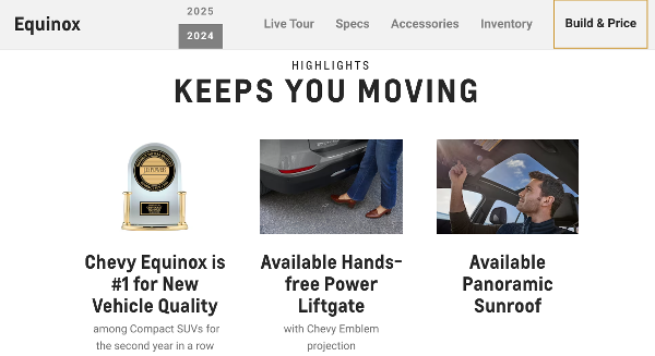
They can cherrypick data. J.D. Power says the Chevy Equinox offers the best new vehicle quality among compact SUVs. But Car and Driver says the Equinox is the 19th-best compact SUV and calls it “underpowered,” “unremarkable,” and “showing its age.” Which ranking do you think Chevrolet promotes on its website and social channels? Many brands go further and cherrypick the best data from within a single study or dataset.
The Chevrolet website brands about Equinox’s #1 rating from JD Power, not its #19 rating on Car and Driver. Source: Chevrolet.
They can compare apples to oranges. That RAB study cited above [pdf] defines “heavy radio” listeners as those who consume 2+ hours per day on weekdays or weekends. But “heavy social media” and “heavy TV” users have to consume 2+ hours per day on both weekdays and weekends, and “heavy newspaper” and “heavy magazine” readers only have to consumer 1+ hour per day. I can’t say why the RAB used different definitions for different groups — but I’m certain it wasn’t to make radio look worse.
A study offering a very different definition for heavy radio users than for heavy users of other media. Source: Radio Advertising Bureau.
Smart writers know they must consider the messenger before publishing third-party data. If you can avoid citing sources with a vested interest in what the numbers say, you should. And if you have no choice but to use this data, first look for these common tricks, and then make the source’s bias clear in your copy.
What’s the most biased data copy you’ve seen lately? Post it in the comments below or on LinkedIn. And if you want good data delivered to your inbox, subscribe here.


