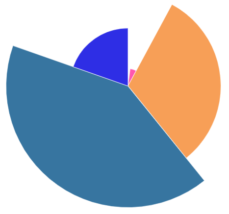
Last week, data graphics tool Infogram tricked one of my clients into making the worst pie chart I’ve ever seen.
Just look at the mess above. It looks more like the Wu-Tang logo than a data graphic. The huge blue-gray slice represents 41% of survey respondents; the small royal blue slice represents 20% of respondents. (Yes, data labels would have been useful—but that’s far from the biggest problem here.)
The biggest problem? The visual weight in this data graphic couldn’t be any more misleading. This chart uses different heights for each slice of the pie. It makes the widest slices taller—meaning they’re bigger than they should be. And it makes the narrowest slices shorter—meaning they’re artificially small.
If the graphic accurately reflected the data, the blue-gray slice would be almost exactly twice as large as the royal blue slice. Instead, the blue-gray slice is seven times bigger.
It turns out Infogram pushes lots of customers towards this awful format. As I wrote this post, four of the seven most recent graphics posted to Infogram’s pie chart examples page use deceptive weighting:
Screenshot of the Infogram pie chart example page, featuring lots of badly-weighted pie charts. Source: Infogram.
No matter what charting software you use, be sure to follow the basic rules of visual weight and data labels. And if you’re an Infogram user, avoid this format—and maybe look for software that doesn’t encourage you to mislead readers.
What’s the best or worst data graphic you’ve seen lately? Let me know in the comments below, or on LinkedIn or Twitter.
Want good data delivered to your inbox? Subscribe here.


