• About
  • Blog
  • Contact
Menu

The Good Data Project

Street Address
City, State, Zip
Phone Number
Good data illuminates the world. Bad data confuses and obscures.

Your Custom Text Here

The Good Data Project

  • About
  • Blog
  • Contact

Three Ways McKinsey Makes Charts Interesting *And* Accurate

May 16, 2024 Nate Elliott

A bubble chart forecasting the supply of and demand for recycled plastic in 2030. Source: McKinsey & Company.
There are lots of wrong ways to add visual interest to charts. McKinsey shows us the right way.

Read more
In Depicting Data
Comment

Atomic Habits and the "chart so stupid it looks like it's ripped from a multilevel marketing pitch"

May 15, 2024 Nate Elliott

Figure 1 from the book Atomic Habits, showing that if you improve at something 1% every day for a year you’ll be 37.78 times better at that thing by the end of the year. Source: Amazon.

James Clear has sold 15 million copies of a book that apparently contains nothing but made-up charts and graphs.

Read more
In Depicting Data
Comment

Why McKinsey Loves Square Pie Charts

April 11, 2024 Nate Elliott

We think square pie charts are amazing. McKinsey & Company agrees.

Read more
In Depicting Data
Comment

Check and double-check and triple-check your data

March 27, 2024 Nate Elliott

An Emarketer chart claiming a market will grow eightfold in five years, but showing ninefold growth in four years. Source: Emarketer.

One day soon you’ll be glad you did.

Read more
In Explaining Data, Depicting Data
Comment

The Good Data Masterclass

April 7, 2022 Nate Elliott

Screenshot of the Berlin Founders Fund Masterclass webinar titled “How Data Drives Your Success.” Source: Berlin Founder Fund.

Want lots of detail on best practices for creating, depicting, and explaining data? Look no further.

Read more
In Collecting Data, Depicting Data, Explaining Data
Comment

The Sun's data-free "data visualization" Erodes Confidence In Charts and Graphs

January 26, 2022 Nate Elliott

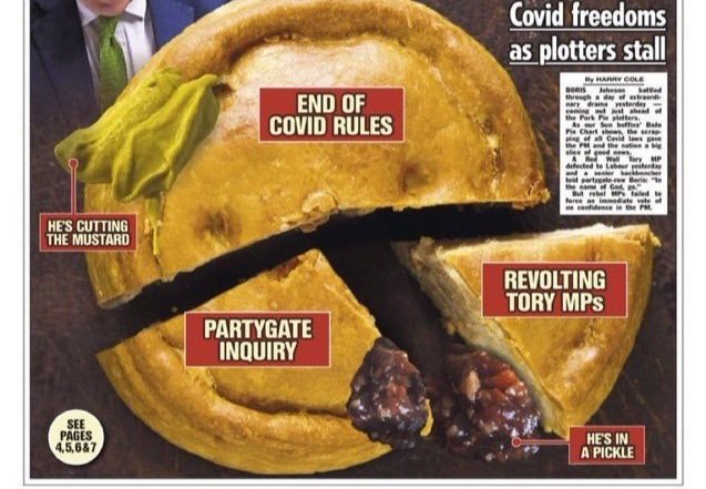
A pie chart designed from a cut-up pork pie, showing slices for “Partygate inquiry,” “Revolting Tory MPs,” and “End of COVID rules.” The chart doesn’t apparently contain any data, just political arguments. Source: The Sun.

You can’t make a data visualization with actual data. Or at least, you shouldn’t. The Sun shows us why not.

Read more
In Depicting Data
Comment

Another Reason To Make Square Pie Charts, And To Consider Visual Weight

December 2, 2021 Nate Elliott

Chart showing that people read area-based pie charts as accurately as traditional pie charts, but make large errors when estimating angles. Source: eagereyes YouTube channel.

Research shows that square pie charts work great and that visual weight really matters.

Read more
In Depicting Data
Comment

The Worst Pie Chart Ever (Courtesy of Infogram)

November 4, 2021 Nate Elliott

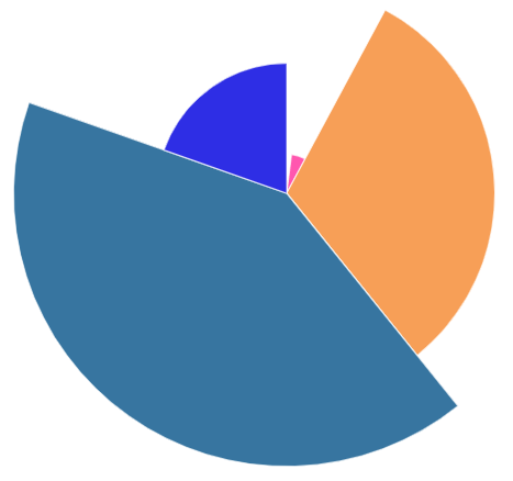
A pie chart in which every slice is a different height; some slices are more than 5 times taller than other slices. Source: Unnamed Nineteen Insights client.

Last week, data graphics tool Infogram tricked one of my clients into making the worst pie chart I’ve ever seen.

Read more
In Depicting Data
Comment

The Beauty of Square Pie Charts

October 27, 2021 Nate Elliott

Square pie chart showing carbon emissions by country in 2017. Source: OurWorldInData.org | CC-BY.

Companies commit awful sins when they create round pie charts. Square pie charts offer several advantages.

Read more
In Depicting Data
Comment

How Florence Nightingale Lied with Data

October 18, 2021 Nate Elliott
Florence Nightingale’s “rose diagram,” two modified pie charts showing deaths in the British Army during the Crimean War.

Florence Nightingale’s “rose diagram,” two modified pie charts showing deaths in the British Army during the Crimean War.

Florence Nightingale wasn’t just a nurse; she was a data geek who used charts as a weapon.

Read more
In Depicting Data
Comment

How to Fix Sprinklr's Charts

October 15, 2021 Nate Elliott
Seven bar charts with almost no labels. Image source: Sprinklr blog

Seven bar charts with almost no labels. Image source: Sprinklr blog

Sprinklr thoroughly violated the Golden Rule of Charts and Graphs — then asked The Good Data Project for advice.

Read more
In Depicting Data
Comment

Gartner’s Heat Map Isn’t So Hot

October 6, 2021 Nate Elliott
Data table with some cells highlighted. Source: Gartner, “7 Key Marketing Channel Shifts as Marketing Budgets Shrink.”

Data table with some cells highlighted. Source: Gartner, “7 Key Marketing Channel Shifts as Marketing Budgets Shrink.”

The research firm mislabeled its own data table — and then made a 2-point difference appear bigger than a 15-point difference.

Read more
In Depicting Data
Comment

Salesforce Accidentally Teaches Us About Visual Weight

October 4, 2021 Nate Elliott
A “bar chart” that uses bubbles in place of bars. Source: Salesforce.

A “bar chart” that uses bubbles in place of bars. Source: Salesforce.

Done well, creative graphics can bring ideas to life. Done poorly, creative graphics can make it impossible for readers to understand the facts.

Read more
In Depicting Data
Comment

Data Labels Make Your Readers Smarter and Save Them Time

September 29, 2021 Nate Elliott
BuzzSumo bar chart without data labels. Image source: Brandwatch/BuzzSumo.

BuzzSumo bar chart without data labels. Image source: Brandwatch/BuzzSumo.

Adding labels to your data isn’t just a meaningless rule; it’s essential to a chart’s very purpose.

Read more
In Depicting Data
Comment

How Facebook Violates the Golden Rule

September 24, 2021 Nate Elliott
Facebook chart titled “Teens who struggle with mental health say Instagram makes it worse.” Image source: Wall Street Journal.

Facebook chart titled “Teens who struggle with mental health say Instagram makes it worse.” Image source: Wall Street Journal.

Few companies make better data graphics than Facebook. But few companies violate the golden rule more often.

Read more
In Depicting Data
Comment

Stop Using Decimal Places in Your Charts and Graphs

September 22, 2021 Nate Elliott
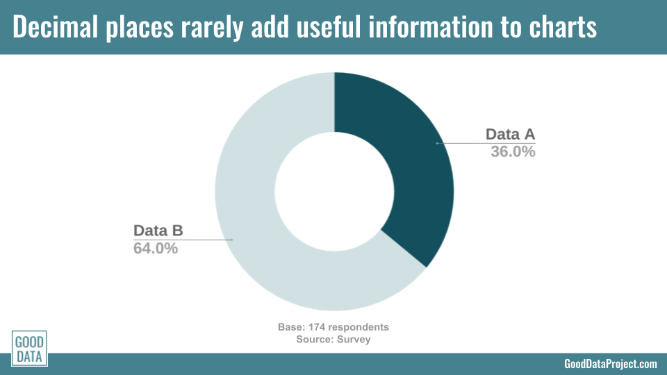
A sample pie chart with two slices: 36.0% and 64.0%. Source: The Good Data Project.

A sample pie chart with two slices: 36.0% and 64.0%. Source: The Good Data Project.

If you want to include decimals in your charts and graphs, make sure you have a good reason. Because most of the time they just get in the way.

Read more
In Depicting Data
Comment

The Best Covid Charts Online

September 17, 2021 Nate Elliott
Line chart of deaths per day due to Covid-19 in British Columbia. Image source: CBC.

Line chart of deaths per day due to Covid-19 in British Columbia. Image source: CBC.

You can find a lot of bad data graphics about Covid-19. Fortunately, the Canadian Broadcasting Corporation has made some very good ones.

Read more
In Depicting Data
Comment

Sprinklr Inadvertently Demonstrates the Importance of Data Labels

September 14, 2021 Nate Elliott
Seven bar charts with almost no labels. Image source: Sprinklr blog

Seven bar charts with almost no labels. Image source: Sprinklr blog

Software vendor Sprinklr went public in June, and is now valued at $4.5 billion. But the company recently published a pile of data charts without labels, and those aren’t worth a dime.

Read more
In Depicting Data
2 Comments

The Golden Rule of Charts and Graphs

September 8, 2021 Nate Elliott
Image credit: Excerpt from Unlucky Haiti (1981-2010) by Jer Thorp | CC BY-SA 2.0

Image credit: Excerpt from Unlucky Haiti (1981-2010) by Jer Thorp | CC BY-SA 2.0

When I help clients build data graphics I give the same advice over and over. I've come to think of it as the Golden Rule of Charts and Graphs:

Display all the data you need to tell an honest story, and no more.

Read more
In Depicting Data
Comment

Introducing the Good Data Project

September 7, 2021 Nate Elliott
Image credit: Some cheerful data by dirkcuys | CC BY-SA 2.0

Image credit: Some cheerful data by dirkcuys | CC BY-SA 2.0

I can’t think of anything more important than data. Good data tells stories that illuminate the world around us. Bad data confuses and obscures.

Unfortunately there’s a lot more bad data in the world than good.

Read more
In Explaining Data, Depicting Data, Collecting Data
Comment

Subscribe to The Good Data Project

Want updates delivered to you inbox? Sign up here. Our promise: No spam, just good data.

Thank you!

©2021-2025 Nineteen Insights

POWERED BY SQUARESPACE