Marketers, salespeople, and journalists should leave decimal places out of nearly every chart they make.
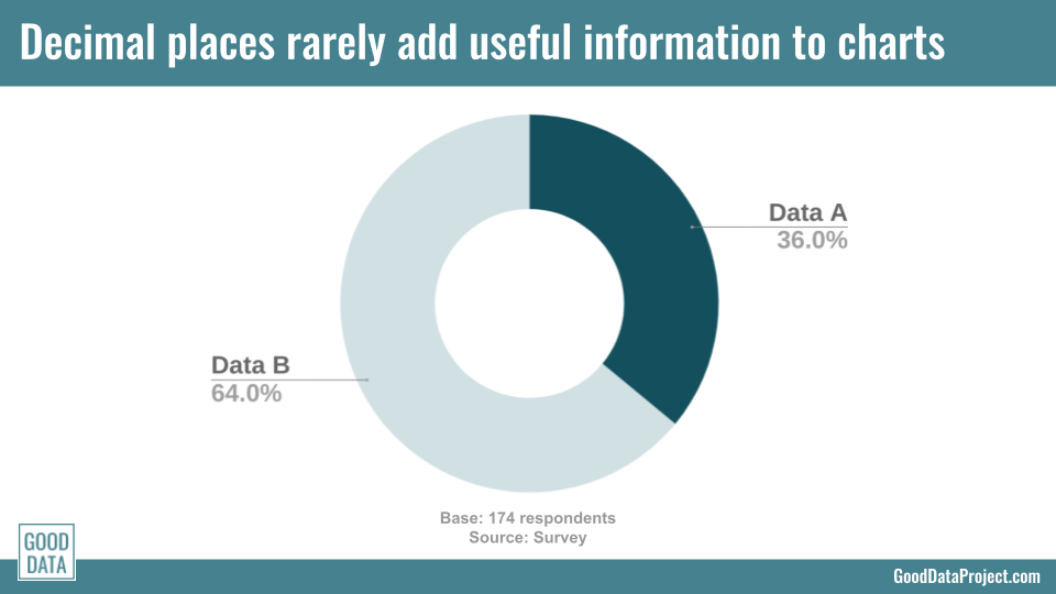
Recently a client sent me the chart shown above. (Details have been changed to protect the well-intended.) The data had a good title, was clearly labeled, and correctly indicated the data source.
The problem? Those damned decimal places.
Some people use decimals in their charts to make their data look more precise. Others include decimal places because that’s simply the default setting in their software. (It is in my favorite, Google Docs.)
But decimal places rarely add useful information to charts. I encouraged this client to remove the decimals from their chart for three reasons:
The decimals don’t help tell a better story. Remember the Golden Rule of Charts and Graphs: “Display all the data you need to tell an honest story, and no more.” This chart doesn’t need decimal places to tell its story. It’s clear that about one-third of survey respondents fit in category A and about two-thirds fit in category B. A few tenths here or there won’t change readers’ understanding of the data.
The decimals add precision, but not accuracy. It’s always possible to depict your data more precisely: If it’s more precise to say “36%” than to say “about one-third,” then it’s also more precise to say “36.0%” than “36%.” But precision isn’t the same as accuracy. My client’s survey had a margin of error over 5%, meaning the real percentage of this population that fits in category A could be less anywhere under from 31% to over 41%. Specifying tenths of a percentage is a waste of time.
In this case, the decimals literally say nothing. Even if your chart would somehow benefit from showing tenths or hundredths, in my client’s data both decimal places worked out to .0%. If your data points are whole numbers, count yourself lucky and just show the whole numbers.
Sure, there are a handful of times it makes sense to use decimal places. Maybe you’re showing comprehensive data with little margin of error, like revenue numbers. Maybe you’re displaying small numbers where decimals matter; 2.4 of something is 50% higher than 1.6 of something else. Or maybe you work in scientific research, where decimal places are required. (Though if you fit into that last category, this business-focused blog may not be for you.)
But if you want to include decimals in your charts and graphs, make sure you have a good reason. Because most of the time they just get in the way.
Think I’m right? Think I’m wrong? Let me know in the comments below, or on LinkedIn or Twitter.
Want good data delivered to your inbox? Subscribe here.

