It’s easy to make fun of a pie chart without actual data, like the one above. But there’s a real danger here: That people will learn to dismiss all data visualizations as deceptive.
No surprise that this lesson comes from The Sun, Britain’s most-popular but least-trusted daily tabloid. Last week, as conservative UK Prime Minister Boris Johnson faced intense criticism for throwing parties in 2020 and 2021 — in violation of his own strict lockdown orders — the right-leaning Sun sprang to the PM’s defense.
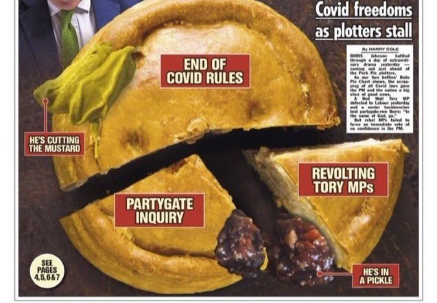
The paper’s weapon of choice? A pie chart. In this case, one designed from that classic old-time British favorite, a pork pie. And while the pie pictured on The Sun’s front page likely contained pork shoulder and bacon and thyme, it didn’t contain any data.
The Sun simply created small slices of pie to represent the damaging parts of the story — “Partygate inquiry” and “Revolting Tory MPs” — and then left the majority of the pie to represent how the Prime Minster planned to distract the public and escape censure: “End of COVID rules.” The chart also highlights traditional pork pie condiments to correctly state that the PM is “in a pickle,” and to express hope that his decision to prematurely end COVID rules will help him “cut the mustard.”

Cover of The Sun newspaper claiming that the “PM is a crust ahead” and using a pork pie “pie chart” to make its case — despite the absence of any data. Source: The Sun.
The Golden Rule of Charts and Graphs tells us to “display all the information you need to tell an honest story, and no more.” The Sun’s pie chart certainly told a story, and it certainly displayed information (albeit in the form of opinion rather than data). I’m just not sure it bothered with the honesty.
And while this created mirth in social media, there’s real danger in abusing charts and graphs this way. Not every data visualization is honest; The Sun makes that abundantly clear. But if people learn to simply dismiss every piece of data they see visualized, we’ll lose a vital tool for informing people’s understanding and guiding their decisions.
What’s the worst chart you’ve ever seen in the newspaper? Let me know in the comments below, or on LinkedIn or Twitter.
Want good data delivered to your inbox? Subscribe here.