• About
  • Blog
  • Contact
Menu

The Good Data Project

Street Address
City, State, Zip
Phone Number
Good data illuminates the world. Bad data confuses and obscures.

Your Custom Text Here

The Good Data Project

  • About
  • Blog
  • Contact

Nearly 3 examples of ridiculous numerical constructions

September 4, 2024 Nate Elliott

A Tiffany & Co. promotion declaring that they’ve made the US Open trophies for “over 36 years.” Source: Nineteen Insights.

Only say “over” or “under,” or “more than” or “nearly,” with round numbers. Otherwise you just sound silly.

Read more
In Explaining Data
Comment

No, It's Not Harder To Get Into The NYC Marathon Than An Ivy League School

May 22, 2024 Nate Elliott

A headline claiming “the NYC Marathon is harder to get into than Ivy League schools,” edited for correctness. Source: The Wall Street Journal.

There are lots of correct ways to describe this data. The Journal didn’t choose any of them.

Read more
In Explaining Data
3 Comments

Three Ways McKinsey Makes Charts Interesting *And* Accurate

May 16, 2024 Nate Elliott

A bubble chart forecasting the supply of and demand for recycled plastic in 2030. Source: McKinsey & Company.

There are lots of wrong ways to add visual interest to charts. McKinsey shows us the right way.

Read more
In Depicting Data
Comment

Atomic Habits and the "chart so stupid it looks like it's ripped from a multilevel marketing pitch"

May 15, 2024 Nate Elliott

Figure 1 from the book Atomic Habits, showing that if you improve at something 1% every day for a year you’ll be 37.78 times better at that thing by the end of the year. Source: Amazon.

James Clear has sold 15 million copies of a book that apparently contains nothing but made-up charts and graphs.

Read more
In Depicting Data
Comment

600 Billion Trillion M&Ms, And The Power of Concrete Examples

April 15, 2024 Nate Elliott

Not quite Avogadro’s Numbrr of M&Ms. Source: M&Ms by Greg Willis via Wikimedia Commons, remixed.

The best way to explain an abstract number? Encourage your readers to imagine something concrete and familiar.

Read more
In Explaining Data
Comment

Why McKinsey Loves Square Pie Charts

April 11, 2024 Nate Elliott

We think square pie charts are amazing. McKinsey & Company agrees.

Read more
In Depicting Data
Comment

Causation Is Really Powerful — And Really Hard To Prove

April 8, 2024 Nate Elliott

Newspaper headline: “How the Flint water crisis set schoolchildren back.” Source: The Washington Post.

You can’t just present two facts that sound logical together and call it causation.

Read more
In Explaining Data
Comment

Never trust an "up to"

April 4, 2024 Nate Elliott

A pitch deck slide claiming PhageLab’s technology eliminates “up to” 100% of salmonella. Source: TechCrunch.

When someone says “up to,” you can be pretty sure they’re the ones who are up to something.

Read more
In Explaining Data
Comment

Don't just describe your data; explain it

April 3, 2024 Nate Elliott

Bar chart showing that older US sports fans are more likely to follow baseball than younger US sports fans. Source: Statista.

Yes, data stories must be correct and reliable. But they have to be meaningful as well.

Read more
In Explaining Data
Comment

Check and double-check and triple-check your data

March 27, 2024 Nate Elliott

An Emarketer chart claiming a market will grow eightfold in five years, but showing ninefold growth in four years. Source: Emarketer.

One day soon you’ll be glad you did.

Read more
In Explaining Data, Depicting Data
Comment

Shiny Bunk Nuggets

March 21, 2024 Nate Elliott

It’s amazing how much online “wisdom” is actually complete garbage.

Read more
In Explaining Data
Comment

Three Clues Someone’s Lying About Data

March 18, 2024 Nate Elliott

Image credit: Pinocchio [macro] by jessiefish | CC BY-NC-ND 2.0 DEED

When people tell you they’re making up numbers, believe them. Here are three clear indicators.

Read more
In Explaining Data
Comment

Horseshoes, hand grenades, and Data Stories

March 7, 2024 Nate Elliott

Image credit: Horseshoes by John Loo | CC BY 2.0 DEED

Every day I encounter data stories that are both technically correct and wildly inaccurate.

Read more
In Explaining Data
Comment

Why your exciting data headline is probably wrong (And how to fix it)

March 5, 2024 Nate Elliott

Image: Chart showing the share of skier visits at Vail Resorts that use a subscription lift ticket vs a non-subscription lift ticket. Source: Vail Resorts via Chartr via Gobbeldy.

Make sure your data copy is faithful by verifying the sample and the statement.

Read more
In Explaining Data
Comment

The Good Data Project featured by Fast Company

February 19, 2024 Nate Elliott

Image: Screenshot of The Good Data Project featured on Fast Company.

Fast Company has featured our piece ‘Stop using data you can’t source.’

Read more
In Explaining Data
Comment

Absurd sources create absurd claims

February 13, 2024 Nate Elliott

Image source: BetterHelp Facebook page.

If a data source just doesn’t look right, don’t repeat it.

Read more
In Explaining Data
Comment

I am the greatest?

February 5, 2024 Nate Elliott

Image credit: “ ‘Muhammad Ali’ by Australian-born artist Brolga” by Franco Folini | CC BY-SA 2.0 DEED

It’s your job to sniff out biased data so you can avoid repeating brand-funded nonsense.

Read more
Comment

Facts don't last forever

January 31, 2024 Nate Elliott

A Forrester report published in 2014 alongside a 2022 trade publication story citing that 8-year-old data. Image credit: Forrester and The Digital Restaurant.

Lots of things used to be true. But even good data doesn’t last forever.

Read more
In Explaining Data
2 Comments

Stop using data you can't source

January 30, 2024 Nate Elliott

Image credit: The crunchy snack that smiles back by AllieKF | CC BY-SA 2.0

If you can’t find a number’s source, you cannot use it. Otherwise you’ll end up looking like a goldfish.

Read more
In Explaining Data
Comment

Make sure your data actually supports your data story

January 24, 2024 Nate Elliott

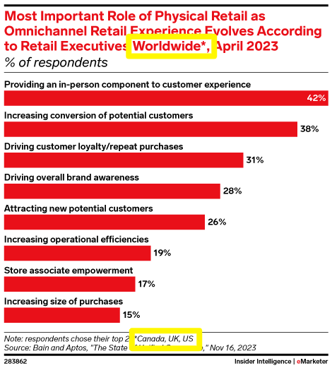
A chart claiming to show worldwide data, with an asterisked note admitting that data comes from just Canada, the UK, and the US. Source: Insider Intelligence.

We know it’s obvious, but: Only use data that relates to your topic, and only make statements the data can support.

Read more
In Explaining Data
Comment
Older Posts →

Subscribe to The Good Data Project

Want updates delivered to you inbox? Sign up here. Our promise: No spam, just good data.

Thank you!

©2021-2025 Nineteen Insights

POWERED BY SQUARESPACE