Everyone has told a data story at some point. But almost no one has been trained how. The Data Story Mandate can help.
Read moreThe Good Data Masterclass
Want lots of detail on best practices for creating, depicting, and explaining data? Look no further.
Read moreDon't make your survey respondents lie
I hate to lie. And I really hate it when surveys give me no other option.
Read moreHow to make sure your questions and answers work together
If your answers don’t match your question, you can’t get good data. But there’s an easy trick to make sure they do.
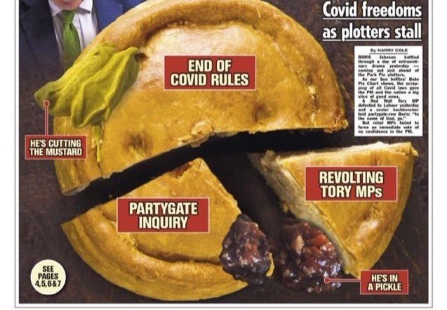
Read moreThe Sun's data-free "data visualization" Erodes Confidence In Charts and Graphs
You can’t make a data visualization with actual data. Or at least, you shouldn’t. The Sun shows us why not.
Read moreDon't test two ideas in one question
Twitter poll asking “Favorite Wes Anderson film?” Response options are: “The Grand Budapest Hotel,” “Rushmore,” “Love them all,” and “Hate them all.” Source: Twitter.
To get the best survey data, make sure you investigate one idea at a time. Often that means asking two questions rather than one.
Read moreStop Biasing Your Survey Respondents
There a lots of ways surveys bias their respondents, intentionally or not. Make sure to avoid them.
Read moreWhy survey response options must be mutually exclusive and collectively exhaustive
The biggest problem with most survey and poll questions? They’re not “MECE.”
Read moreAnother Reason To Make Square Pie Charts, And To Consider Visual Weight
Chart showing that people read area-based pie charts as accurately as traditional pie charts, but make large errors when estimating angles. Source: eagereyes YouTube channel.
Research shows that square pie charts work great and that visual weight really matters.
Read moreWhy Most Social Polls Suck
Social media is awash in surveys and polls. Most of them suck. But they don’t need to.
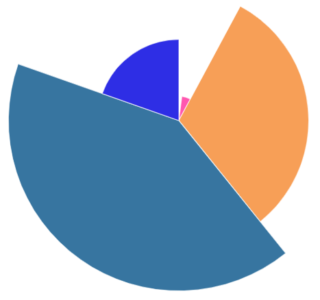
Read moreThe Worst Pie Chart Ever (Courtesy of Infogram)
Last week, data graphics tool Infogram tricked one of my clients into making the worst pie chart I’ve ever seen.
Read moreThe Beauty of Square Pie Charts
Square pie chart showing carbon emissions by country in 2017. Source: OurWorldInData.org | CC-BY.
Companies commit awful sins when they create round pie charts. Square pie charts offer several advantages.
Read moreHow Florence Nightingale Lied with Data
Florence Nightingale wasn’t just a nurse; she was a data geek who used charts as a weapon.
Read moreHow to Fix Sprinklr's Charts
Seven bar charts with almost no labels. Image source: Sprinklr blog
Sprinklr thoroughly violated the Golden Rule of Charts and Graphs — then asked The Good Data Project for advice.
Read moreGartner’s Heat Map Isn’t So Hot
Data table with some cells highlighted. Source: Gartner, “7 Key Marketing Channel Shifts as Marketing Budgets Shrink.”
The research firm mislabeled its own data table — and then made a 2-point difference appear bigger than a 15-point difference.
Read moreSalesforce Accidentally Teaches Us About Visual Weight
A “bar chart” that uses bubbles in place of bars. Source: Salesforce.
Done well, creative graphics can bring ideas to life. Done poorly, creative graphics can make it impossible for readers to understand the facts.
Read moreData Labels Make Your Readers Smarter and Save Them Time
BuzzSumo bar chart without data labels. Image source: Brandwatch/BuzzSumo.
Adding labels to your data isn’t just a meaningless rule; it’s essential to a chart’s very purpose.
Read moreHow Facebook Violates the Golden Rule
Facebook chart titled “Teens who struggle with mental health say Instagram makes it worse.” Image source: Wall Street Journal.
Few companies make better data graphics than Facebook. But few companies violate the golden rule more often.
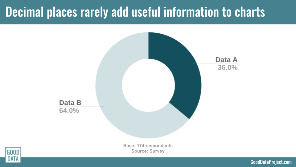
Read moreStop Using Decimal Places in Your Charts and Graphs
If you want to include decimals in your charts and graphs, make sure you have a good reason. Because most of the time they just get in the way.
Read moreThe Best Covid Charts Online
Line chart of deaths per day due to Covid-19 in British Columbia. Image source: CBC.
You can find a lot of bad data graphics about Covid-19. Fortunately, the Canadian Broadcasting Corporation has made some very good ones.
Read more


